Color & Readability
Full value color combinations
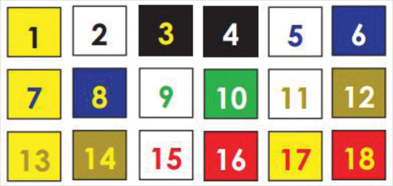
Shown are 18 color combinations tested for visibility, using primary and secondary colors, of full hue and value. Visibility is ranked in the sequence shown, with 1 being the most visible and 18 being the least visible.


Readability
It is essential that outdoor designs are easy to read. Choose colors with high contrast in both hue and value. Contrasting colors are viewed well from great distances, while colors with low contrast will blend together and obscure a message. In fact, research demonstrates that high color contrast can improve outdoor advertising recall by 38%.
A standard color wheel illustrates the importance of contrast, hue and value. Opposite colors on the wheel are complementary. An example is red and green (as shown above). They represent a good contrast in hue, but their values are similar. It is difficult for the human eye to process the wavelength variations associated with complementary colors. Therefore, a quivering or optical distortion is sometimes detected when two complementary colors are used in tandem.
Adjacent colors, such as blue and green, make especially poor combinations since their contrast is similar in both hue and value. As a result, adjacent colors create contrast that is hard to discern. Alternating colors, such as blue and yellow, produce the best combinations since they have good contrast in both hue and value.